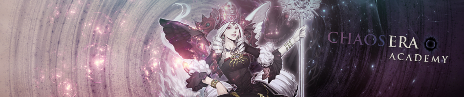
Looks a bit washed out but that's probably just my preference. Though with it being that way, I don't understand why House has extreme contrast then... since the render is being blown out so that you start losing detail in areas. From my photographic experience you should never hit true white and true black since those are lost information and unable to truly edit.
Then that text... makes me think of chalk writing. So I think there are better choices for fonts, and maybe having the text partly hidden behind the render, part of the render (hand), or one of the elements in the background.
Otherwise I like the colours, and I can see the elements all drawing your eye to the focal point in some way, even if they are all a bit random.


 Subject: House M.D.