plz answer the poll and leave comments on improvment below tryin to learn
Staxx
Posts : 16
Duel Points : 100
Duel Season : 0-0-0
Duel Career : 0-0-0
Subject: Re: Just trying some new styles Tue Jul 23, 2013 11:47 pm
download a program like gimp or photoshop
MasterMarcus
Team : Ultimate Legends
Posts : 615
Duel Points : 100
Duel Season : 0-0-0
Duel Career : 35-0-70
Subject: Re: Just trying some new styles Wed Jul 24, 2013 12:07 am
i use photoshop
Staxx
Posts : 16
Duel Points : 100
Duel Season : 0-0-0
Duel Career : 0-0-0
Subject: Re: Just trying some new styles Wed Jul 24, 2013 12:34 am
oooohhh
Liyana
Team : Dreamstate
Posts : 2796
Duel Points : 100
Duel Season : 8-0-1
Duel Career : 75-0-48
YGOPro Name : Liyana
Subject: Re: Just trying some new styles Fri Jul 26, 2013 11:05 am
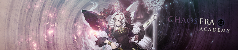
Those sigs aren't finished yet, you need to incorporate effects, and I tend to like the render to be a bit bigger, since its the main focus of the sig
Disclaimer: I am a nub.
Dragoon
Posts : 907
Duel Points : 150
Duel Season : 3-0-3
Duel Career : 28-0-21
YGOPro Name : Dragoon
Subject: Re: Just trying some new styles Fri Jul 26, 2013 11:20 am
1st Sig: The effect around the render doesn't seem clear enough. I suggest sharpening it. Also the Sig overall doesn't seem to blend in with the background make the back a bit more stylish so that the Render gets mire attention. And like Liyanna said the sky's main focus is the render so make it bigger.
2nd Sig: That yellowish white part in the bottom right corner seems bad it averts the attention also it seems to me like you just made the background using soft brushes. Personally I don't recommend that. Use different effects/backgrounds and experiment with it you should eventually get something that you are happy with.
Well I am a beginner to GFX anyways but these are just my opinions


 Subject: Just trying some new styles